PSDevCon 2024 - PUIK (PrestaShop UI Kit) - The new UI kit from PrestaShop
Explore a summary of the PUIK presentation delivered at the second PrestaShop Developer Conference
During the second PrestaShop Developer Conference on November 6, 2024, I was able to introduce PUIK (PrestaShop UI Kit) to participants. This blog post provides a written summary of the presentation. During the talk, the audience gained a clearer understanding of PrestaShop’s UI Kit, based on the new PrestaShop Design System. Learn how this library aims to provide a complete set of reusable components for the entire PrestaShop ecosystem. The GitHub repository is available here.
Introduction
Initial objective: create a library of UI components in Vue.js
PUIK is a library of UI components developed in Vue 3. It is an open source project under the MIT license, not to be confused with the UI kit of PrestaShop, which is integrated into the PrestaShop solution and uses Bootstrap for styling and jQuery for interactivity. The initial objective was to provide the same components to ensure consistency and address the need for design uniformity across the products and services offered within the PrestaShop ecosystem.
The choice of Vue.js was driven by its widespread use among the PrestaShop SA teams. Another major reason is that the PrestaShop solution itself incorporates this framework: some back office pages and modules already use Vue.js.
Architecture in version 2
The current version of PUIK at the time of writing this article is 2.3.0. While still maintained for critical bugs, the first version will eventually be deprecated.
For the remainder of this article, we will focus on this new iteration of PUIK!
Version 2 is characterized by a significant architectural change, adopting a more modern monorepo structure. PUIK is now divided into five packages available on the public NPM registry, including the introduction of a new component library using web-components:
| Package Name | Description |
|---|---|
| @prestashopcorp/puik-components | Vue.js component library |
| @prestashopcorp/puik-web-components | Library of Web-components |
| @prestashopcorp/puik-resolver | Resolver for on-demand auto-import of Vue components (unplugin-vue-components) |
| @prestashopcorp/puik-theme | Library containing all the CSS component classes |
| @prestashopcorp/puik-tailwind-preset | Tailwind CSS preset containing all the design tokens |
Discovering the library
Available components
Since its creation in late 2021, PUIK has matured and currently offers a fairly wide range of 35 Vue components as well as 27 web-components.
You can explore and test them through the Storybook documentation here.
The technical stack
PUIK is built on a modern technical stack, integrating current best practices and technologies:
| Category | Technology |
|---|---|
| Package manager | PNPM |
| Versioning | Changesets |
| Framework | Vue 3 |
| Bundler | Vite |
| Documentation | Storybook, Zeroheight |
| External Libraries | Headless UI, Radix Vue, Popper Js, Sortable Js |
| Style | Tailwind, Sass, PostCSS |
| Tests | Vitest |
| Lint | Eslint |
| Review | Chromatic |
| DX | Hygen |
Let’s take a closer look at the technologies used:
Package Manager: PNPM since version 1.
PNPM is perfectly suited to the project’s new monorepo architecture as it natively supports the Workspace protocol.
All the packages are located in the packages folder at the root of the repository, and the Storybook documentation is in the docs folder. The project also includes a Vue application for testing the components (playground).
//pnpm-workspace.yaml

packages:
  - packages/*
  - docs
  - playground
Each package now has its own Vite configuration: vite.config files, except for puik-theme, which is processed with Sass and PostCSS during compilation.
Versioning with changesets
Changesets allows for interactively incrementing version numbers while adhering to the SemVer specification. The tool automatically detects version changes and applies necessary patches by identifying dependencies between packages within the workspace.
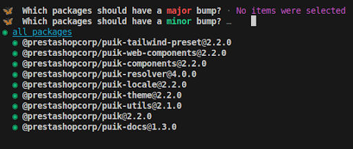
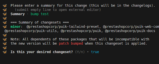
Use of Chromatic to facilitate reviews and testing by the design team.

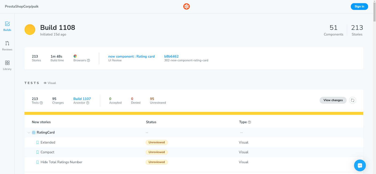
Chromatic is a solution that provides a graphical interface, integrated with Storybook, enabling the design team to perform the review and validate visual tests. Through a GitHub Action, a new Chromatic build is created for each pull request made on the main branch of the repository.
Chromatic interface:
Structure of a component
Creating components with PUIK is simplified thanks to the Hygen template generator, allowing the creation of all files with a single command line!
Example - creating the awesome-component:
pnpm component awesome-component
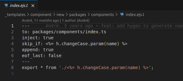
From the root folder _templates, Hygen generates all the necessary files for the component or injects new lines of code as needed if existing files need to be updated.
Example of a Hygen file (EJS template language) with configuration options (file path, position of code lines to inject into existing files, etc.):
Review of main files
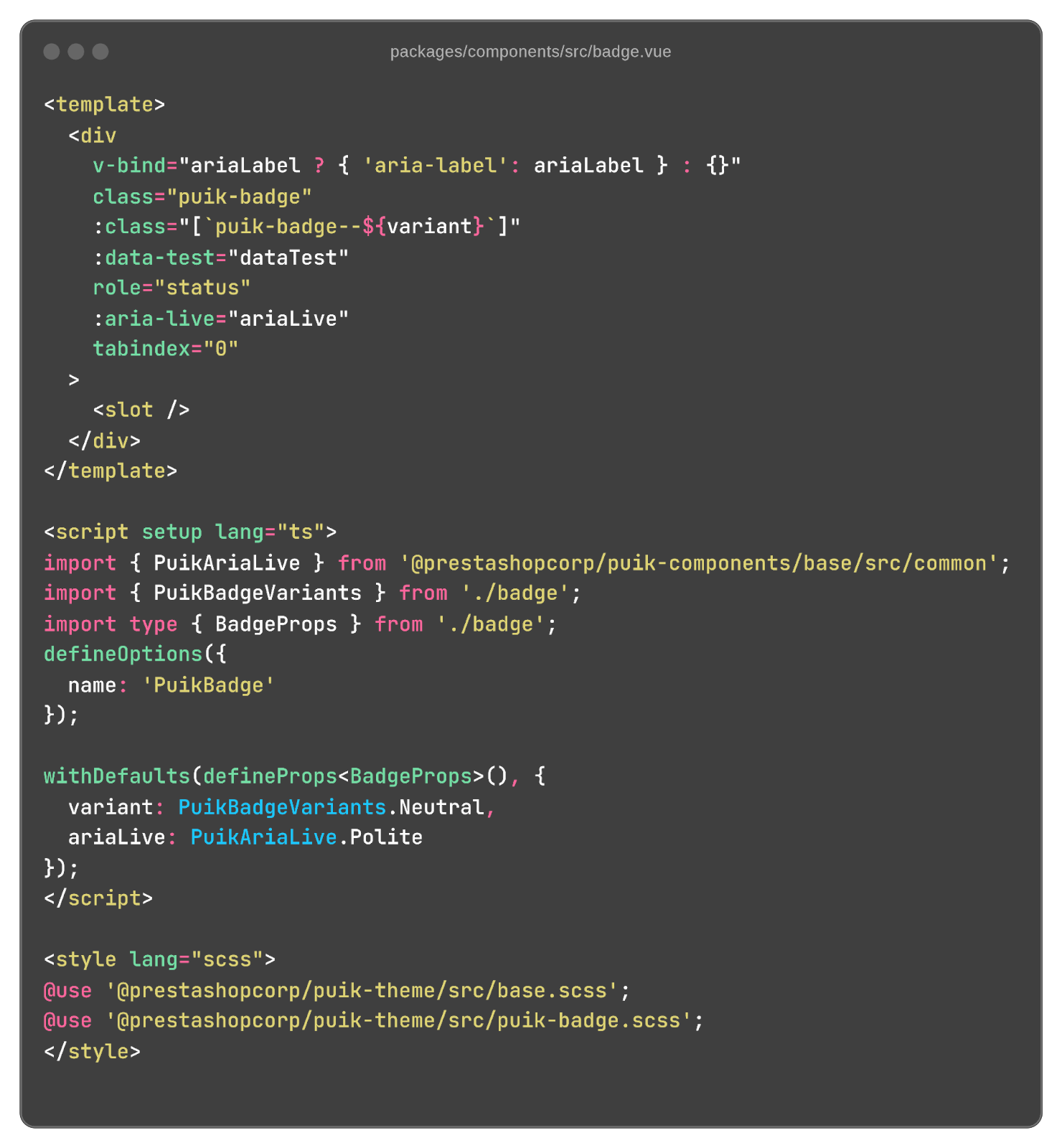
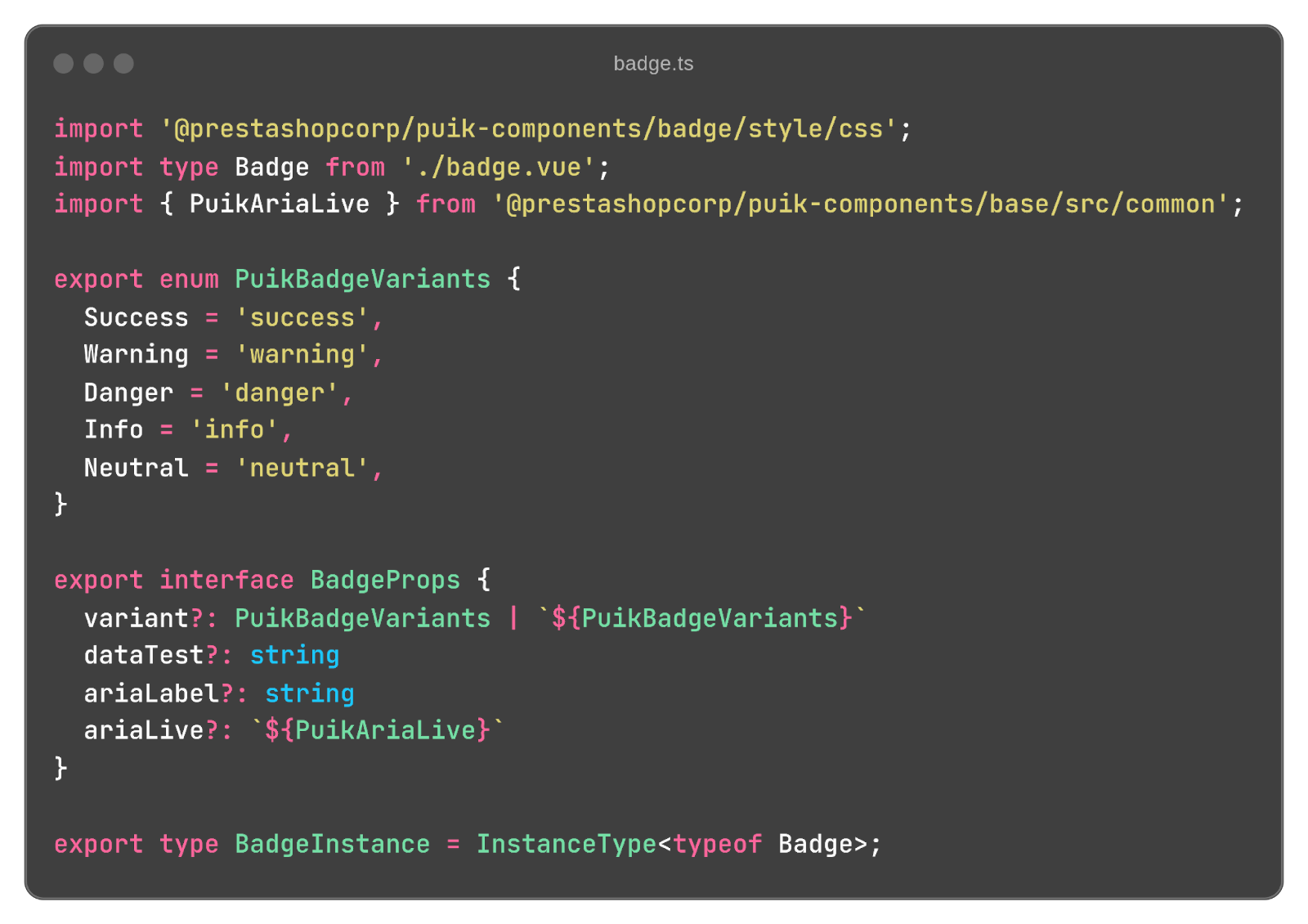
In the component’s src folder, there is an SFC file in Vue 3 (Composition API, using the script setup with the TS language, and a style tag configured with the SCSS language) and a TypeScript file primarily for defining props and emits.
Example - PuikBadge component and its Vue file:
Example - PuikBadge component and its TypeScript file:
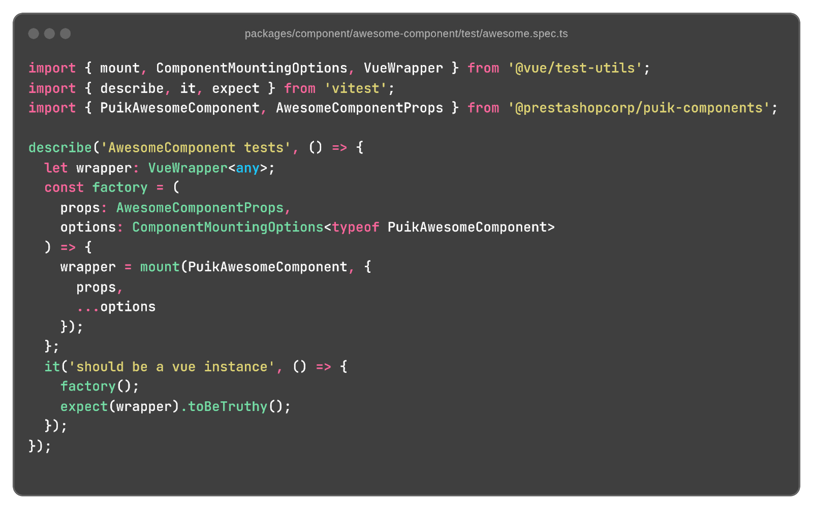
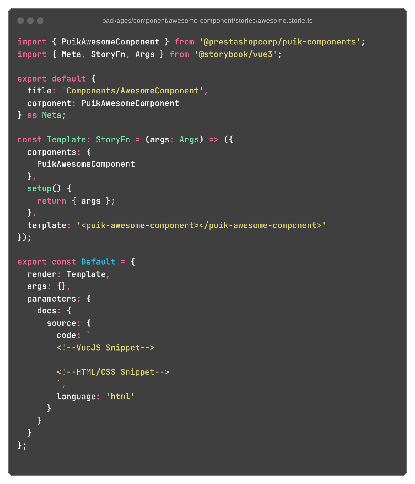
Two other subfolders (test and stories) contain, respectively, the Vitest file (based on Jest) for unit testing and the Storybook documentation files.
Example - draft of awesome-component.spec.ts generated by Hygen with an initial test to verify that the component is indeed an instance of Vue.
Example - draft of awesome-component.storie.ts generated by Hygen for Storybook documentation:
Puik-theme package and style conventions
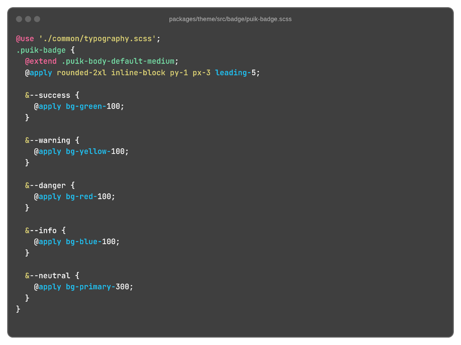
The classes are prefixed with puik- and use Tailwind directives (@apply, @extend) within the SCSS classes.
Thus, Tailwind classes are never used directly in the Vue template.
Example - SCSS file badge.scss:
Puik-web-component package
Web-components are created from Vue files using the native defineCustomElement method. This approach allows converting Vue components into web-components without having to fully recreate a dedicated variant.
The main advantage of this method is that it allows retaining all the existing logic and code of the Vue components, thus making it easier to reuse them in different contexts, including those where using Vue is not possible or desired.
For more details, refer to the official documentation here.
However, there are some limitations. For example, certain advanced features of Vue, such as slotProps, are not available when used as web-components. This may require adjustments or compromises when implementing complex components.
Despite these constraints, using defineCustomElement offers an elegant solution to easily integrate PUIK components into non-Vue projects, thus promoting greater flexibility and interoperability of the library.
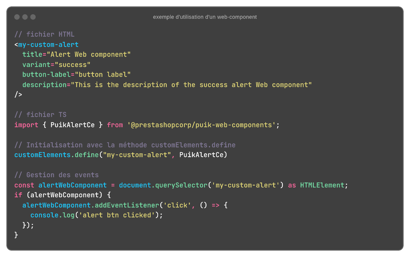
Creation of the custom element awesome-component:

Usage example:
Areas for improvements
Puik is still under development, and many improvements are on the way! Here are some ideas being considered by the PrestaShop SA team working on PUIK:
Documentation
In addition to Storybook, we are also considering creating more comprehensive documentation with Vitepress for a better user experience, providing, for example, templates with multiple components (Puik Experience project).
Development of new components and refactoring
We will also continue to enhance the library and adapt certain components to make them compatible as a web-component.
Performance improvements
Optimizations are also planned to enhance performance and reduce the size of builds.
New features
We also plan to implement new features such as dark mode and RTL/LTR support.
New translations
Some textual elements (e.g., placeholders, etc.) are currently translated only into French and English. We aim to expand support for additional languages.
Explore new use cases for PrestaShop with PUIK
In parallel, the open source PrestaShop project is also continuously evolving. The next major release, version 9, will notably introduce a new API for the Back Office (API platform), paving the way for new interactions with the solution, such as the creation of Admin - headless - dashboards, where PUIK will naturally play a key role.
Acknowledgements
To conclude this presentation, we would like to take the opportunity to remind everyone that the success of PUIK relies on an active and engaged community. The current and voluntary contributions come from all the different squads of PrestaShop SA.
We would like to warmly thank all the contributors for their efforts and dedication.
Thank you to them!
