Designing the new PrestaShop default theme
How we rebuilt the front office to suit any merchant
When merchants use PrestaShop for the first time, they’re offered a basic shop with demo products and a default theme. This basic theme is essential for the merchants to have a clear insight of what their new shop will look like. For the 1.7 version of the software, we’ve decided to revamp this default theme which we called “Classic”.
Main goals of the Classic theme
With around 600 free native features, PrestaShop is the ideal software for anyone wishing to get started with e-commerce. But the task is not an easy one when you’re not familiar with all the standards of e-commerce nor a web professional.
- The major aim of the default theme is to allow any merchant to meet the Web and e-commerce best practices.
- The second aim is to be entirely adjustable and customizable, to allow every online shop to be singular. Do you have any specific requirement? The modules from the Addons marketplace are here to allow you to improve your website using as many features as you like.
Design challenges
Don’t judge a book by its cover. If the final result of the Classic theme might lead you to think it was easy to implement, it was actually a real challenge in terms of graphic design and user experience. To make it accessible to everyone, our Product team had to face several challenges, such as:
- Offering a theme compatible with any kind of business from the textile industry to the food one, ranging from technology, luxury or wholesale outlets).
- Implementing the standard best practices of e-commerce for any merchant at any level.
- Offering a design of interfaces that is sleek enough so that merchants can imagine their products in it, and see how easily they can adapt the design to their graphic identity.
- Allowing an optimal user experience, with a graphic design focused on the products on show as well as a simplified and smoother buying journey.
- Offering adjustable blocks compatible with the overall graphic design of the shop allowing merchants to choose whatever modules they need.
- Allowing merchants to fulfill any visual identity at an affordable price for an esthetic and clear website.
- Creating international interfaces, compatible with e-commerce all around the world, in the 165 countries where Prestashop is being used.
- Being responsive, to meet with the ever-increasing e-commerce market on mobile phones around the world.
The choices of this theme’s revamp were not only based on graphic criteria but on our promise to put e-commerce at everyone’s reach.
Graphic choices
The product constraints described above were used as a common thread for the graphic choices of the theme.
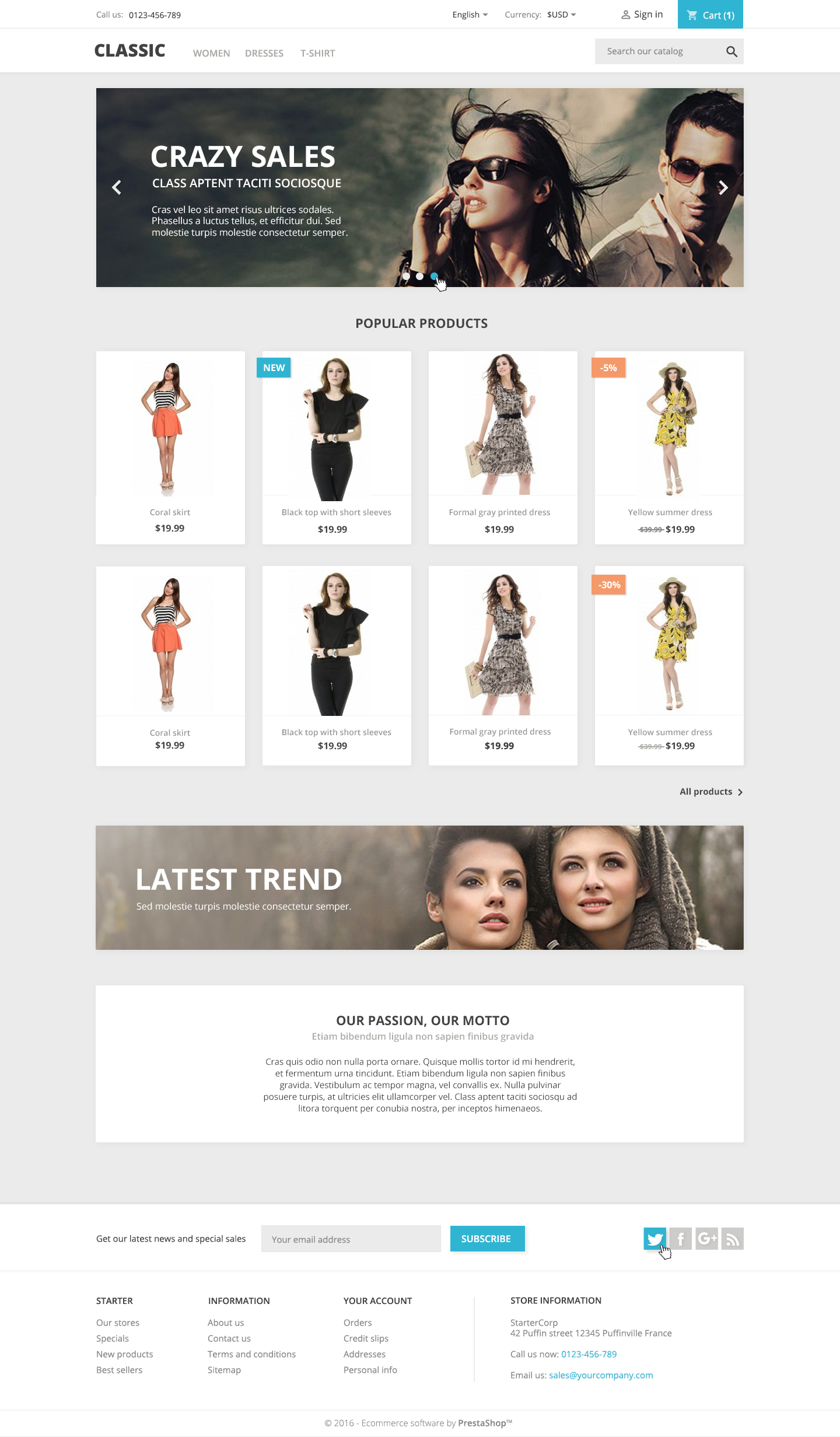
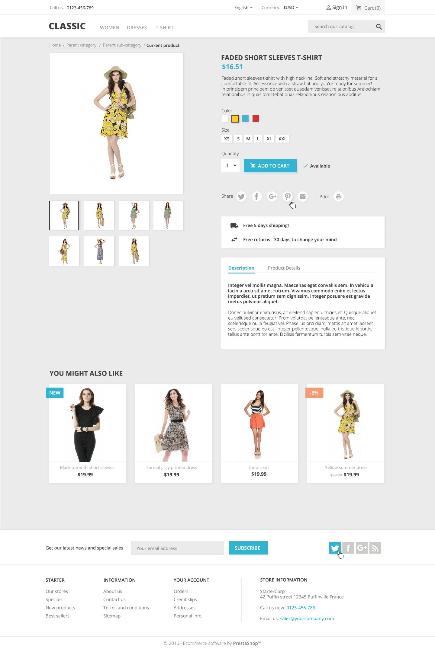
Imagine that you should sell a house. If your potential buyers see it with furnitures, frames, porcelain figurines and other wooden duck collections, they will have more difficulties to project themselves into it and to have an idea of its volume and potential rather than if it was painted in white with very minimal furnishing. The same applies for the Classic theme. The idea was not to create the perfect visual identity for the next womenswear store to come but on the contrary to offer a neutral framework, where products could be easy to identify, as well as a faceted navigation, a fluid purchase funnel and easy-to-identify call to actions. These choices answer some specific project needs:
- The background colors (white and grey) allow to focus on the products and to simplify the reading process of the interfaces.
- The blue calls to action contrast with the background and are more easily viewable and identifiable.
- The Open Sans typography is a Google font that has three major benefits: it is very easy to read, very complete (897 characters), and it allows you to translate in a maximum of Latin alphabet-based languages that are used by a large majority of our merchants.
- The minimum size of the paragraphs meets readability criteria.
- The flat design combined with shadow effects allow to have light interfaces while preserving the meaning of dynamic elements.
- The alert colors (orange and red) answer the standards of most of the merchants and are clearly identifiable by their customers as alert messages.
- The icons are taken from Google Material, an Open Source library, just like our software. This aspect is very important to us and the advantage of this library is that our merchants will be able to add icons to their websites for free without leaving the graphical universe.
- The demo products from the shop are being created. As a matter of fact, we’re aware that our catalog of demo products is mainly about woman clothing. But this is going to change! Our Product team is working on a new products catalog that is more up-to-date and that will allow our merchants to better see how their products can fit in their new store. Merchants will then be free to customize their theme’s interfaces, to change all the elements and to add their graphic identity to it.
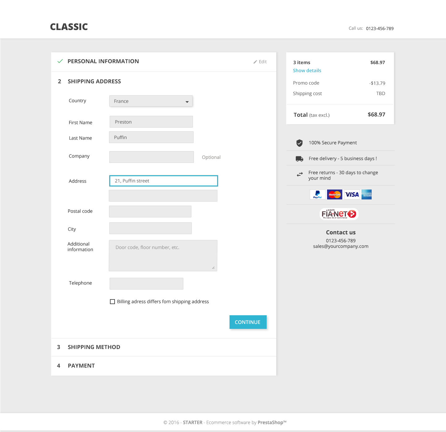
One-page checkout
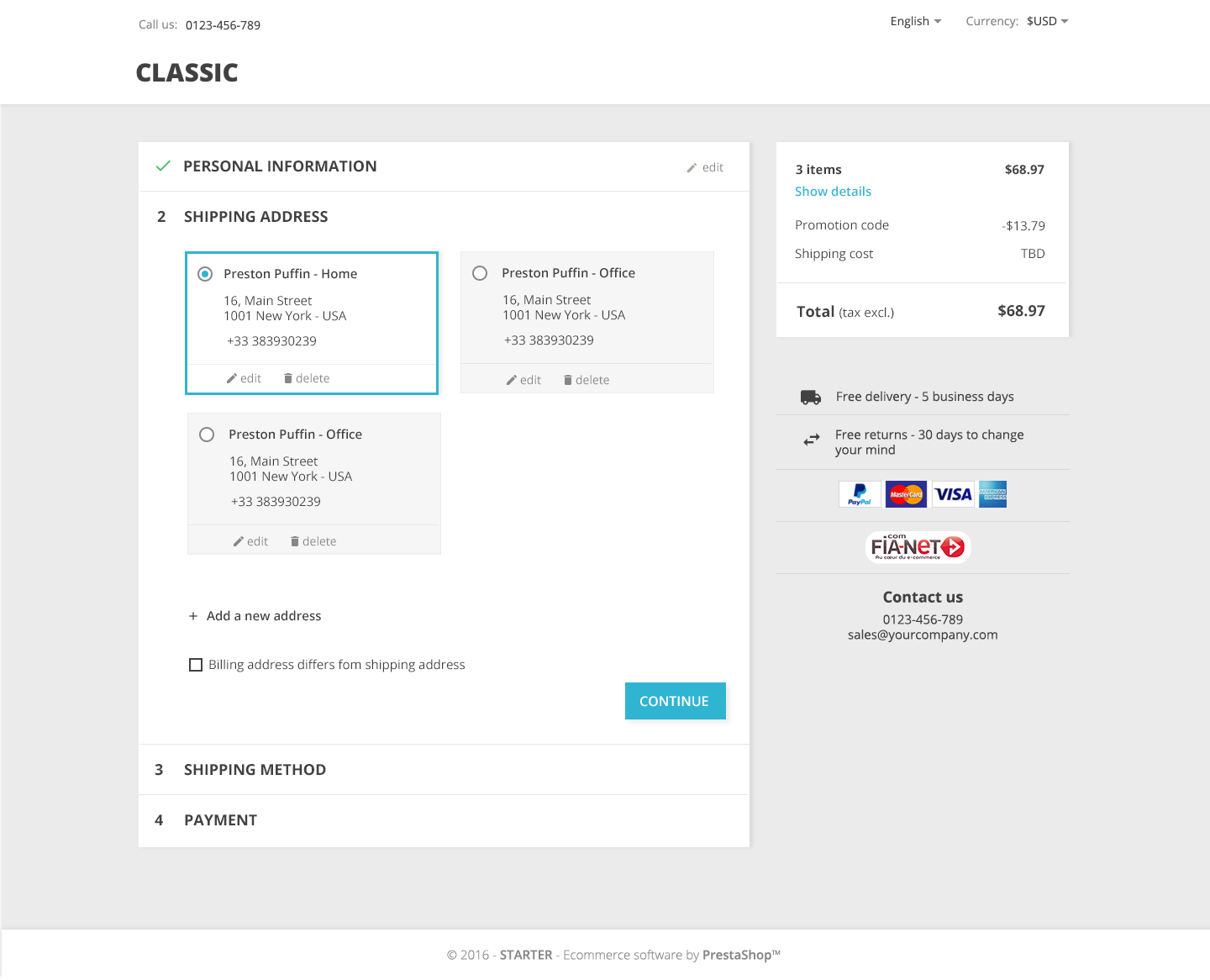
The purchase funnel is essential for an e-commerce website. A well-built checkout process facilitates the conversion and customer loyalty. On the other way round, if it is not well designed, it can lead to cart abandonments. This additional revamping challenge of the basic theme is huge, since here, more than anywhere else, the impact on the success of our merchants will be decisive. You don’t buy pizzas the same way as handbags. And a lot of themes are based on the default PrestaShop theme, so if the conversion is not good enough, that’s the whole ecosystem that might suffer from it.
So the main goal of the purchase funnel for the Classic theme is to propose the best possible user experience. This funnel is intended to:
- Convert as efficiently as possible.
- Present steps identifiable at a glance.
- Have a speedy buying process.
- Put the best practices of online shopping at the merchant’s disposal.
- Better integrate the necessary modules (payment, delivery, etc.).
- Be compatible with foreign languages.
- Be easy to maintain and debug.
All this while complying with the same design constraints as those mentioned above (interface readability, adjustable blocks, international compatibility, etc.).
This purchase funnel is built on one page, with unfolding blocks. This choice is not a random one. To reach this conclusion, we have:
- Tested tens of shops and numerous different online selling styles.
- Followed the Design thinking methodology.
- Performed user tests with 25 merchants coming from all backgrounds.
- Iterated the production of those interfaces according to those test results.
One-page checkout vs. Five steps
The methodology followed for this kind of purchase funnel allowed us to realize that a one-page checkout process (or OPC) presents a lot of benefits for a shop:
- It is considered by customers to be quicker than a funnel with 5 distinct steps on different pages.
- It allows the customers to anticipate the steps to follow before the payment.
- It allows the customer to check its cart at any time during the checkout process.
- Returning to the previous step to make a change appears more reassuring, since the information will not be lost.
- The page structure is responsive (to allow for payments on mobile phones).
Standard vs. specific
One thing we must keep in mind is that PrestaShop is a free and Open Source software designed to meet the needs of all merchants, whether they are small or big. That’s the reason why the Classic theme should meet all standard needs and not only specific ones. For customization purposes, Open Source offers all the necessary tools (modules, access to source code, etc.) to have a unique shop.
Alpha vs. Release (work in progress)
We’re not quite ready! The Product team is currently working on the 1.7 version. So the Classic theme is not final, and more user tests and iterations should follow. The demo products inherited from version 1.6 will be replaced by an enriched catalog. The site behavior will also be fully responsive… Exciting challenges are still to come, with the will to place the best of e-commerce at everyone’s reach.
Prestashop is hiring
At PrestaShop, we have a mantra: “Work like a Captain, Play like a Pirate”. If you want to join the community and take part in the adventure, remember that:
- We’re hiring senior PHP developers (in Paris, France)
- We’re hiring a senior product designer (in Paris, France)
- You can take part into user tests (in Paris, France)
- You can contribute to the PrestaShop project (anywhere!)