Reworking the "Update Assistant" Module V7: Our Experience
Transforming Complexity into Efficiency: The Story Behind Update Assistant V7
Let’s face it—our Update Assistant module was messy. The front-end was confusing, the user experience was challenging, and even minor adjustments were a little more complex than what we would have liked.
As part of the Seamless Upgrade & Extensibility squad, one of our key missions is to improve the reliability of PrestaShop upgrades. And to do that, we knew the Update Assistant module needed more than just a few patches—it needed a complete reinvention.
So, when we set out to build version 7, we didn’t just fix bugs—we redesigned the whole experience. Cleaner code, a smarter structure, and a user journey that actually makes sense.
Here’s how we dismantled it and rebuilt it from the ground up. 🚀

Technical and UX Overhaul
Before we started working on this complete rework, the module had accumulated a number of technical and usability issues that were becoming harder and harder to manage. On the technical side, all the front-end code was crammed into a single JavaScript and CSS file. There were no quality checks in place—no linting, front-end unit tests, or style validation. Every small change meant diving into a large, unstructured file, which made even minor updates risky and time-consuming. The interface was built as a single-page layout where everything was shown or hidden purely through CSS, with display: none, making it fragile and inefficient.
On top of that, the user experience wasn’t great either. All the different features—update, backup, restore—were squeezed onto the same page, with a flood of messages, alerts, and options all fighting for attention. Knowing where to start, what was important, and what could wait was hard. This lack of hierarchy, combined with the fact that the page was slow to load, made for a frustrating experience. The main reason for this slowness came from a process running in the background that checked whether the shop met all the technical requirements to perform the update, a necessary step before displaying the page.
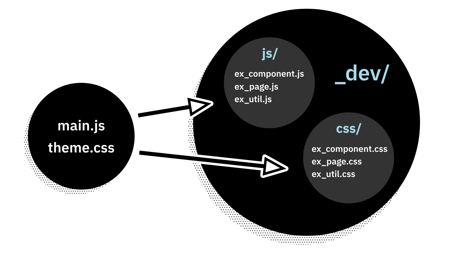
To tackle these issues, we made several structural and technical improvements. We introduced a clear project structure with a _dev directory, switched to Vite to handle asset compilation and optimization, and added proper quality tools like ESLint, Stylelint, and Prettier. We also introduced Jest to cover our logic with unit tests. External libraries are now managed via NPM, which gives us better control over dependencies and makes future updates easier.
On the UX side, we completely rethought the page by splitting the key functionalities into distinct workflows—one for updating, one for backups, and one for restores. Each workflow has its own guided steps, with clearer messages and a more logical order. We also integrated partial page updates via AJAX, to avoid full page reloads and make the whole experience more fluid.
All these changes combined make the module cleaner, more maintainable, and above all, easier to use for the merchant.
What obstacles did we encounter?
Despite the technical and UX improvements, the interface did not feel as fluid and responsive as we would have expected while an update was running. One of the key pain points turned out to be the log display itself. During our tests, we noticed that navigating to the log page could sometimes cause the browser to freeze or even crash, occasionally blocking the update process entirely.
A first analysis of the module revealed that an Ajax request could complete in under 100 milliseconds and return a response, yet the interface could take up to a full second to render the logs before triggering the next request. This clearly highlighted our first major bottleneck.
First axis of investigation – Display
Our initial investigation focused on how each log entry was displayed. We had implemented icons—first as images and later as icon fonts—to indicate the status (success, warning, error). However, this approach also gave us valuable insights into areas where we could further optimize the system:
- Using images slowed down the loading process.
- Replacing images with font icons further degraded performance.
- Even removing the icons altogether did not resolve the problem.
In the end, we decided to leave the icons as they were and shifted our focus to identifying other factors impacting performance.
Second axis of investigation – Performance
We then conducted a performance analysis to identify what was overloading the browser. Although having many <div> elements (each log entry in its own container) was a concern, our analysis revealed an even more significant issue. We discovered that forcing the scroll to the bottom of the list triggered a full re-render of the container. Each time the module returned a new log, the browser had to recalculate the maximum length of the logs and update the entire <div>, significantly impacting performance, especially when new entries were continuously added.
The adopted solution
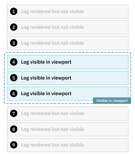
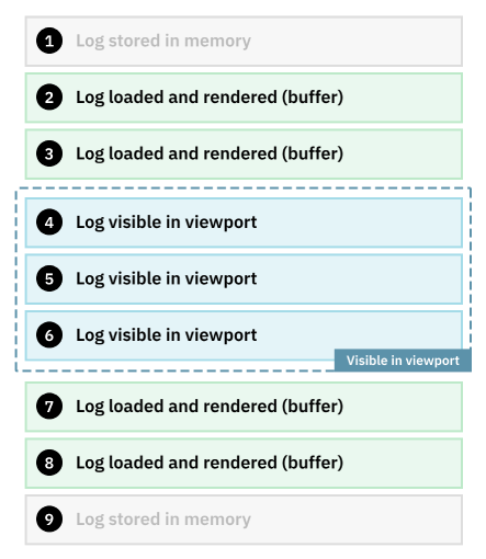
To address this challenge, we implemented a virtual scrolling mechanism—a solution inspired in part by this article about virtual scrolling. The concept is simple: instead of rendering all log entries at once, we only render those visible in the viewport (with a small buffer above and below to ensure smooth scrolling). The viewport refers to the portion of the list that is currently visible to the user, while all other logs are kept in memory and not inserted into the DOM.
This technique is commonly used for lists with fixed item heights—like what you’d find in a spreadsheet application—but our case introduced two additional complexities:
- Each log entry can have a variable height, since some messages (especially errors) can span multiple lines.
- The height of the log container itself can change depending on the progress and state of the update process.
These factors made it more difficult to calculate both the overall scrollable height and the exact position of each entry. To overcome this, we dynamically measured the height of each log entry as it was created, updated the total container height in real time, and added a debounce mechanism to the scroll events to avoid overwhelming the browser with constant recalculations.
Beyond improving interface performance, this optimization had a direct impact on the overall update process itself. Each time the front-end requests new logs, it also signals the back-end to continue the update. If displaying logs takes too long (due to rendering bottlenecks), it delays these requests, effectively slowing down the entire update process. By drastically reducing log rendering times, we were able to significantly improve the overall update duration.
In practice, this optimization allowed us to reduce the update time—from over 10 minutes in real-world conditions—to just under 3 minutes.
Conclusion
The overhaul of Update Assistant V7 required significant improvements in both technical architecture (code structure, quality controls, build process) and user experience (segmented workflows, clearer interface). Despite these advancements, managing the log display proved to be a considerable challenge—one we successfully addressed with a custom virtual scrolling solution that accommodates variable element heights.
We invite you to test the V7-beta of the module by downloading it from the Autoupgrade GitHub repository and sharing your feedback. To do so, please create an issue on the PrestaShop GitHub repository and add the “Autoupgrade” label. Your input is invaluable in helping us refine this new version and make PrestaShop an even more powerful and user-friendly platform.
Thank you for your time and happy updating!