The Product Page - Evolution Revolution
When User Experience is back in business
A long time ago, in a galaxy not so far away, we packed PrestaShop with much needed functionalities in its core. The aim was to propose the best ecommerce solution, with the biggest functional scope, answering to almost all of the merchants’ needs — all that while still being free.
And we can say it’s been a success! Features are one of the reasons why merchants choose PrestaShop when they want to create their online shop.
Born to be wild
It’s all about soul-searching. PrestaShop had all these great features, but we thought we could improve something equally important too: the user experience, or UX — making sure that the software’s features are agreeable to use, so to speak.
With the development of PrestaShop 1.7, things have changed. We targeted the dissatisfaction points. That’s the beginning of our new story. Some actions in the back office are not as easy to complete as they should, the user doesn’t always know how to achieve something, and features can have settings spread in several screens — which are not always logically tied.
I’m probably not telling anything new here, but don’t worry, we’re committed to the cause now :)
Rehab
The PrestaShop team has grown since the 1.6 days. With a structured and dedicated Product Team, PrestaShop is now equipped to change its flow. Yes, you’ve read correctly: One of our main goals for the coming releases is to improve the user experience in the back office.
Of course, it’s not as easy as I write it. The first step, which will be available to all in the next major version (v1.7) is focusing on the merchants’ first impression of the back office, and finding ways to guide them in. More precisely, our projects are :
- creation of a merchant onboarding. When the user connects to the back office in order to create a product for the first time, we want her to easily learn about the most interesting parts of that process. And show her that it can be much easier than imagined.
- reworking of the Product page. Not only are we going to update the design, but we are aiming at a true revamping, both technical and functional, in order to make the product creation easier, faster and more logical.
- Reorganization of the left menu. Links are reordered in a more logical and business-oriented way, gathered into 3 main groups.
- Revamping of the Module page to more easily onboard people into the module world; with a page as simple as some of the famous app stores.
In this article I’m going to linger on one specific topic: the Product page. Don’t worry, I’ll talk about the new onboarding process and the reorganization of the menu in coming articles!
Sledgehammer
Creating a product is the first true action merchants do in their back office. If this action is too difficult or too long, they leave. That’s why our objectives for the Product page are:
- All the main actions must be available at a glance;
- Product creation must be easier and faster;
- Merchants must feel they can manage their whole catalog easily.
And to do all that, we revamped almost everything. Here is a global screenshot:
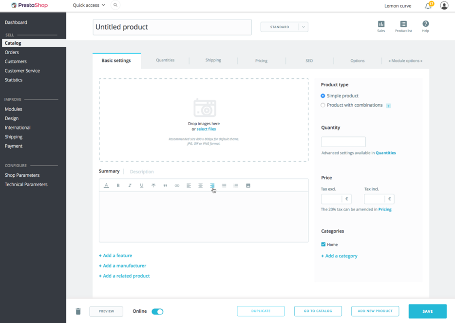
General architecture
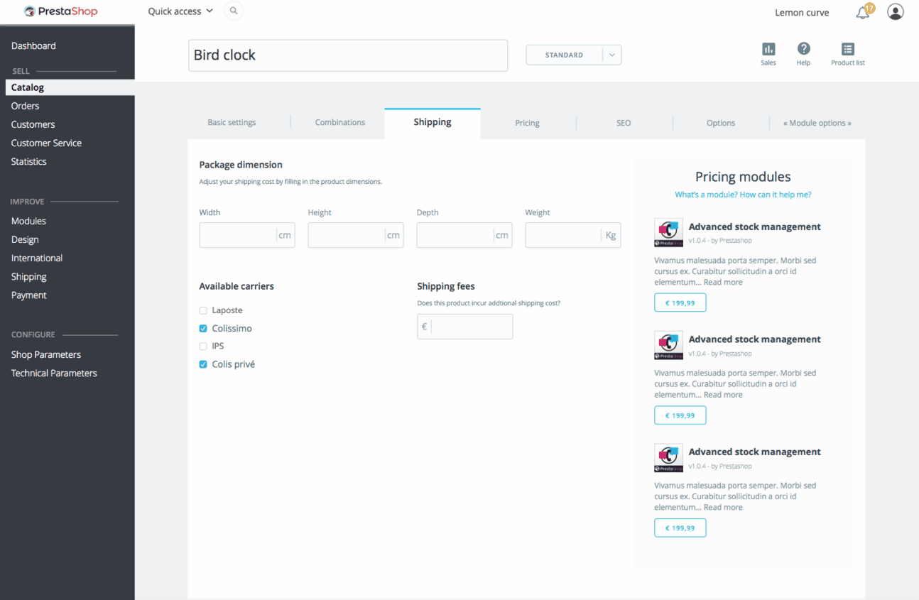
The new page is divided in 6 main tabs, instead of the 12 tabs that you can find in the 1.6 version of PrestaShop. An extra tab is available to hook some modules.
The first of these tab, “Basic settings”, is the main one. More than 50% of merchants will find there everything they need to create a product. If you need to go deeper, the advanced functionalities are found in the 5 other tabs: Quantities, Shipping, Pricing, SEO and Options.

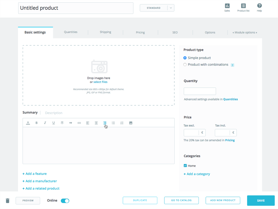
At first sight, there is one noticeable change from the 1.6 Product page: the product’s name and type are now displayed above the tabs, so that you always know which product you are editing:

At the bottom of the page, a persistent bar is displayed to allow merchants to manage the product without having to scroll down. It presents the common actions (Preview, Save, etc.), as well as some new ones you should like — at least I hope so. I’ll tell you more about them at the end of this article.

Main tab
This tab is organized in a way that only the most important product information is displayed here. We organized the information in a much more efficient way: you can now create an entire product in a few clicks, without changing tab!
On the left hand side, you have the product description, including:
- image management
- summary / short description
- long description
- possibility to add some features, a manufacturer, and tie the product to existing related products (formerly called “accessories”)
On the right hand side, you find the main settings of the product:
- whether the product has combinations or not
- quantity
- price and tax
- categories
Of course, if you insert a price or a quantity, it will update the fields in the relevant tabs (pricing, quantities).
Combinations
I think you will agree with me about this one: creating and managing combinations has never been the easiest thing to do in PrestaShop. But once you unlock this achievement, you can face almost everything else in the world of ecommerce :)
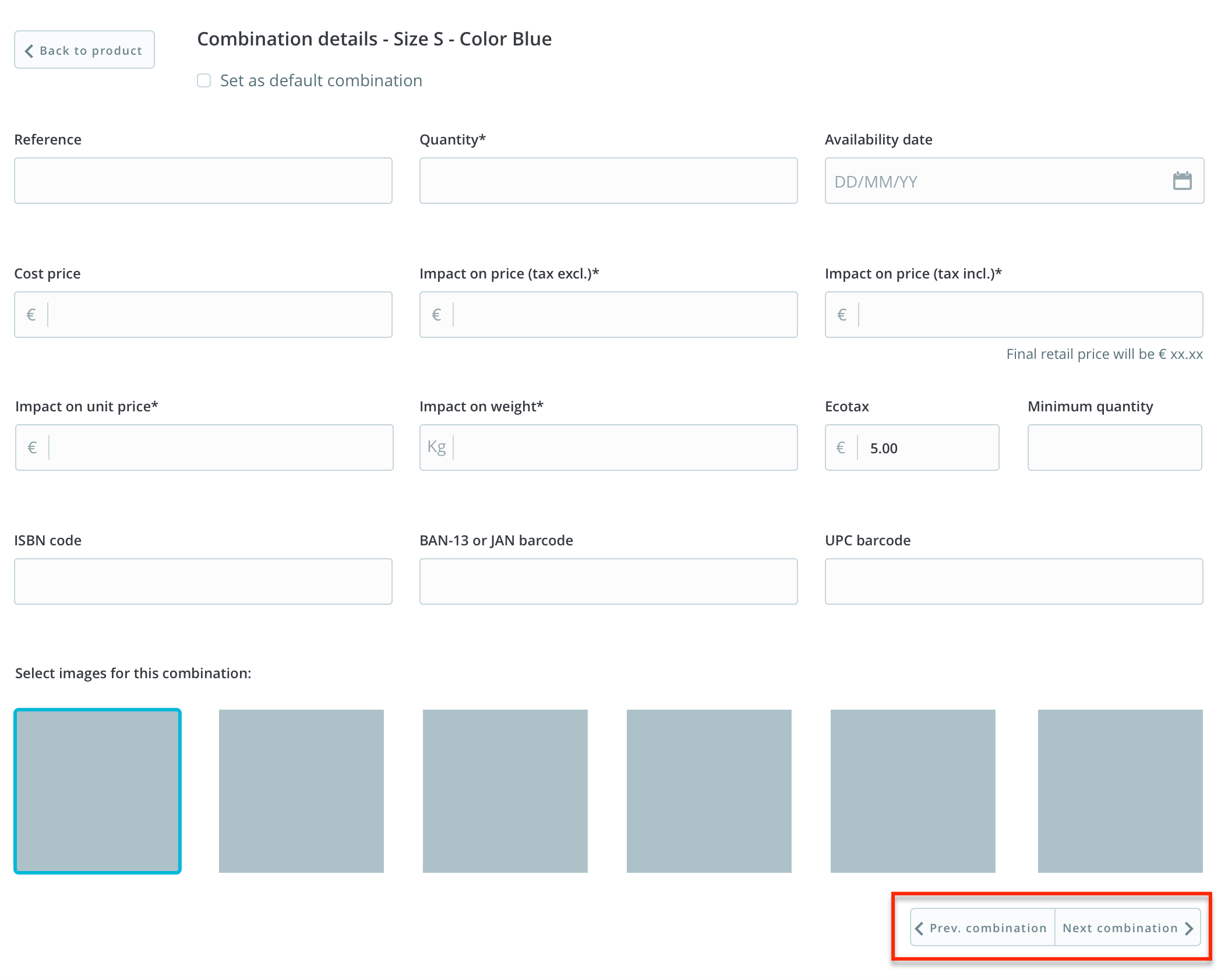
Now, in 1.7, as soon as you configure your product to use combinations, the product page’s tabs and content adapts to this new behavior. For instance, the “Quantities” tab becomes “Combinations”, and this is where you will manage all of them in details — including their quantity.
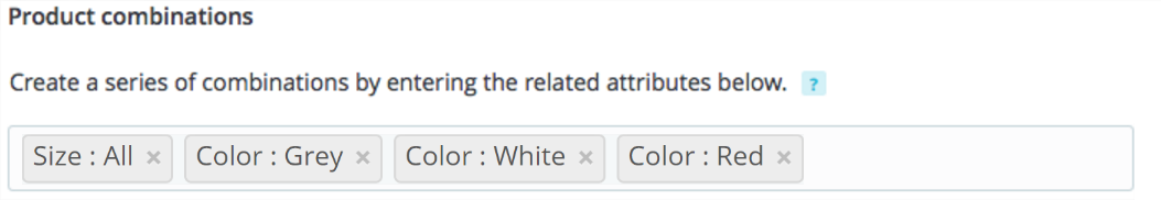
It is now easier to create combinations, and the whole process fits in a single field, as you can see in the screenshot below. You just have to enter the attributes you need for the product, with their values (for example: color: red, color: blue, size: S, size: M), click a button, and PrestaShop takes care of generating the combinations. If you have to create combinations for all the available colors and sizes, just write color: all, size: all and it’s all good.
From there on, if you add more combinations, it won’t delete the previous ones, but will instead add the new ones to the list of already existing combinations.
When editing a combination, you can navigate from one to the next without having to browse back to the main product:
Introducting shortcuts
Still with the intent to help you manage products and catalog efficiently, we reorganized some actions, to which we assigned keyboard shortcuts in order to go faster:
- Duplicate (CTRL + D): it saves the current product and duplicates it. You are redirected to the new one.
- Go to catalog (CTRL + Q): it saves the current product and leads you to the catalog of products. Note that it now sends you to the catalog page you were previously on, NOT on the first page of the catalog. Yay!
- Add new product (CTRL + P): it saves the current product and creates a new, empty product page. This allows you to create products on the fly without having to go back to the catalog page.
- Save (CTRL + S): it saves the product and stays on the current product. Nothing tricky. Yup, no more “Save and stay” button: the “Save” button just saves… and stays.
Navigating throughout products
When you need to edit products one after another, the whole process can be boring: edit, go back to the catalog page, click on the next product, edit, go back, click, and so on and so forth.
As it was a huge request from our community, we tried to make this process easier by displaying a pop-up catalog browser inside the product page, as you can see in the animation below. By clicking on a product of the list, you are redirected to this product page. Of course, this list is not always displayed: just click on the “Product list” icon to display it:
Recommended modules
The way recommended modules are displayed has been changed too. In version 1.6, you had to click on a button to open a list of recommended module for the current context. From now on, in the advanced tabs, the recommended modules are displayed within the page.
These recommended modules will be relevant to each specific topic on the page. Each tab will have its own recommended modules. For example, the shipping tab will display recommended carriers in your region or market. The design is not entirely done but it won’t be blindingly flashy, and will blend gracefully into the current design.
Come as you are
Ever since we started this project, we’ve encouraged people to work with us via a dedicated Gitter channel. You too can come and give us your feedbacks about the new Product page!
The version we are working on is on Github, on the develop branch.
Developers, beware!
If you created modules which target the Product Page, you may be impacted by these changes and will need to adapt your code, if you want them to still work as expected in this new Product page.
In the 1.6 version, it is allowed to have a dedicated tab per module on the Product page. In the 1.7 version, we changed this and added a dedicated tab for all the Product page’s modules, via a new hook called hookDisplayAdminProductsExtra.
If you coded your modules by following the best-practices of both PHP and PrestaShop 1.5-1.6, it should not take you too much time to update your code.
Here are the main information that you will need to update your module:
Hook Parameters
Parameters cannot be obtained from a query string anymore. From now on, an array of parameters is directly passed onto the hookDisplayAdminProductsExtra method.
See this sample hook:
public function hookDisplayAdminProductsExtra($params)
With $params taking these values:
$params [
  "_ps_version"
  "id_product"
  "cookie"
  "cart"
  "altern"
]
Assets
Assets’ URLs must be absolute (meaning, they must start with http:// or https://).
Form fields
The form field names must be created in an array hook of this format: [MODULE_NAME][INPUT_NAME].
DOM
The format of the ID for the module’s container has been modified. Here is its new format: module_MODULE_NAME.
These boots are made for walking
Of course, this is not a one shot improvement. The whole back office will be revamped, step by step, topic per topic. Now that we have embarked on this project, we won’t stop until it’s over. So expect more improvements in the user experience of PrestaShop, in all aspects of the solution (such as what we are doing for the Themes page and the Module page).
Brace yourselves, UX is coming!