PrestaShop episode 1.7: the module page awakens
Why we’re making a new module page, and what’s in it
We’ve been working on this project for a while now, and it is about time we tell you about the new module page we are planning for PrestaShop 1.7.0! Since September, our team (Thibaud, Thomas, Melvin, Guilhem, Léa and myself) has been busy redesigning the outdated module page of version 1.6. Needless to say, it is an important subject for PrestaShop’s business, but most importantly a key step in merchants’ journey to a successful online store.
This article has been updated on January the 22nd, to answer some comments, see at the end of the article.
Why now?
And what are the problems we want to solve?
- A difficult onboarding for beginners
Many of our new users struggle with the concept of modules when they discover the software. They often don’t understand what modules are for, don’t know when a module is fitted to their needs or when it’s adapted to their business maturity. We believe the module page is an important step in learning how you can leverage the power of modules and how you can take advantage of our official marketplace (PrestaShop Addons) when you’re looking to improve the features of your store. - A complex user experience
In addition to this, the current UX is too complicated and misleading: users get confused by the mix of installed and non-installed modules, surprised by the number of pre-installed modules at shop creation, and puzzled by the bare minimum description of modules. And I could also add the low performance and repeated page refresh every time you use the filters. As a consequence, the module page was limiting the productivity of our users.
What do we really really want? (a.k.a. the Spice Girls question)
Our ambition is simple: we want to create an “app store” that is as simple and clear as any app store on a smartphone. Redesigning the module page in PrestaShop version 1.7.0 is a first but important step towards this objective. For merchants building their store, it means the new module page will help them easily find the modules that fit their needs and manage their installed modules.
Of course this project is part of a bigger picture: shape a new user experience in PrestaShop 1.7.0 to make it more user-friendly, and assist our users in building a successful online shop.
Output and important choices
What’s the role of the module page anyway?
We identified 3 use cases, depending on the user profile:
- discover and install new modules to improve your store, when you’re beginning or growing with PrestaShop,
- manage your installed modules, when you have an active shop and need to make it evolve on a daily or weekly basis,
- maintain your modules, when you need to take action (updates or configuration) to guarantee the good functioning of your modules
This is why we divided the navigation in the page into three tabs, each corresponding to a use case. We’ll see them one by one in this article and explain what is underway.
Caveat: the mockups displayed in this post are still work in progress and should not be considered as definitive. Moreover, we’ve added a header and a side menu just for the purpose of seeing the module page in its context - these elements are also work in progress but we’ll talk about this in another post.
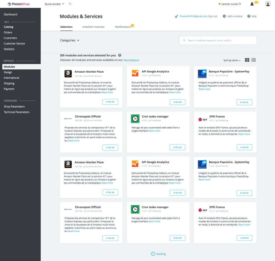
Selection
The “Selection” tab is about discovering new modules to improve your store. Here you’ll find a list of all the modules you can install (and not the ones you’ve already installed).

A quick sum-up:
- Modules are displayed in a new card design that is more suited for product discovery,
- Categories are now consistent with the categories in our official marketplace,
- An improved search bar: we now provide a JavaScript-powered per-keyword search, without any page refresh. We released the code of the PSTagger jQuery plugin under an open source license, so that anybody can reuse it – and improve upon it (it’s still a beta version)!
Installed modules
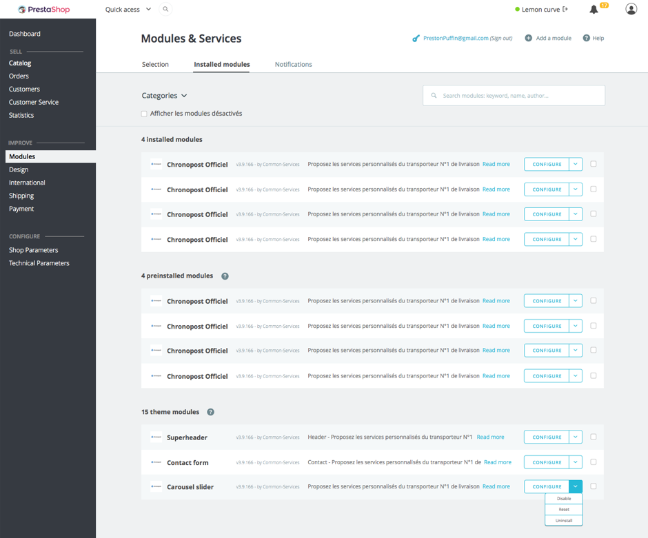
In the “Installed modules” tab, you can manage all your installed modules (of course!)

A quick sum-up:
- Because we wanted to make it simple to manage, we’ve separated the modules you’ve personally installed from the modules that are preinstalled at shop creation.
- By default, only activated modules are visible, but you still can display the disabled modules if you want.
- We also removed actions…:
- …that had become obsolete: disable on mobile/tablet/PC. Since all Themes in 1.7.0 will be responsive by design, these feature was no longer needed.
- …that were redundant: now, there’s no distinction between Uninstall and Delete. When you uninstall a module, its files are deleted. You still can disable a module if you wish to keep your files and configuration.
- An extra point we’re also investigating is to have a section dedicated to modules associated with your theme. It should make it easier to avoid conflicts when installing a new theme. We’ll keep you updated!
Notifications
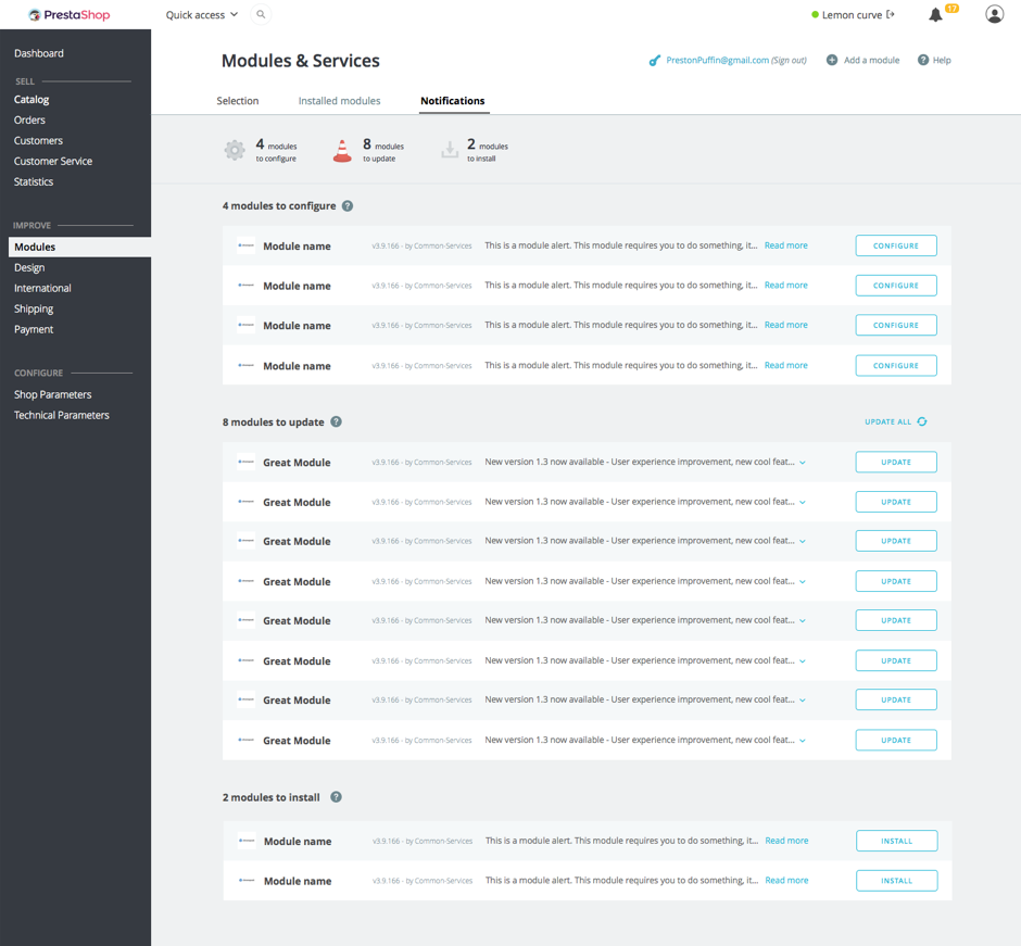
Finally, in the “Notification” tab, you’ll find all the modules to configure, update or install (if you purchased modules on PrestaShop Addons but didn’t install them yet).

Our goal here is to provide you with an overview of all the actions to take, and save you from the cluttered interface of 1.6 that had a pile of notifications.
What we’ve added:
- A configuration key: modules will be able to say if they’re correctly configured. More on that soon in a forthcoming post on the Build devblog.
- A changelog: now you can see what is introduced in a new version (when the changelog is available). You won’t have to blindly trust the update and cross your fingers anymore!
- A list of your purchased modules, if you’ve connected your store to your PrestaShop Addons account.
Symfony2 architecture and debugging
Of course, we’re also taking advantage of the Sf2 architecture that is introduced in version 1.7 to refactor the controller and several methods. We’re also improving stability to prevent crashes and simplify debugging. This implies refactoring the ObjectModel class and creating a new class that will handle the functions that don’t belong to Module instances. We’ll talk more about this in a forthcoming post focused on the technical changes.
Conclusion
We’re working hard to release a beta version very soon. Until then, some other news will follow this post. This article was focused on UX and the next posts will be the opportunity to dive into the technical side of the new modules page.
If you wish to share your questions, feedback and ideas, you’re welcome to do it on our Gitter channel. Looking forward to hearing from you!
May the Force be with you :)
Guillaume <3
Update on module actions (22/01)
I’m following up about module actions:
1. About keeping both the “delete” and the “uninstall” options
Providing both is redundant and confusing for users, and as you know, our goal with 1.7 is to simplify these kinds of interaction. However, deleting the module folder when uninstalling a module would indeed create too much problems if the module contains some custom data. So, thanks to your feedback, we decided to keep the “uninstall” option available, and to remove the “delete” option. Deleting the folder can still be done using your favorite FTP software.
2. About keeping the “disable on mobile/tablet/computer” option:
After receiving your feedback, I asked PrestaShop’s User Club members to answer a short survey about how merchants and developers use the module display options.
Here’s a summary of the results.
We’ve had many answers: 106, mostly from dev/designers and merchants.
Roughly half of our respondents use the option to disable on mobile/tablet/computer. In the vast majority, only a few modules are concerned (less than 5 in 77% of cases), and almost systematically for disabling on mobile (98%). Disabling on other devices, like tablet or computer, is much less used (33% and 28% cases respectively).
What are the modules typically disabled on mobile? Almost only front office features, starting with sliders, and then some others, such as top menu, banner, footer and a few content blocks (contact, tags, CMS, etc.). The main reason invoked for disabling on mobile is performance: for instance, to avoid loading HD images in a slider on a mobile with a poor 3G.
And here are our decisions:
- Remove the “disable on tablet/computer” option. If a module is specifically made for mobile, it shouldn’t be up to the user to disable it on other devices. Developers should adapt their mobile modules accordingly.
- Keep the “disable on mobile” option. It would be better to limit this option to front office modules, but we don’t have an easy way to do it right now. Given the small number of concerned modules, it doesn’t make sense to make this option available for all modules. By limiting it to front office modules, we would gain clarity and keep flexibility for customizing the shop appearance on mobile.
Thank to our community members for their insightful feedback!
