Stock Management in PrestaShop 1.7 - part 2
Second overview on how we’re rebuilding this feature
In a previous article, we’ve explained the reasons why we’re rebuilding the stock management system in 1.7. We detailed the initial brief of this project: the context, our intentions, what was out-of-scope and the expected outcome. In this article, I want to dive into our methodologies and the main steps of this project.
Remember this diagram?
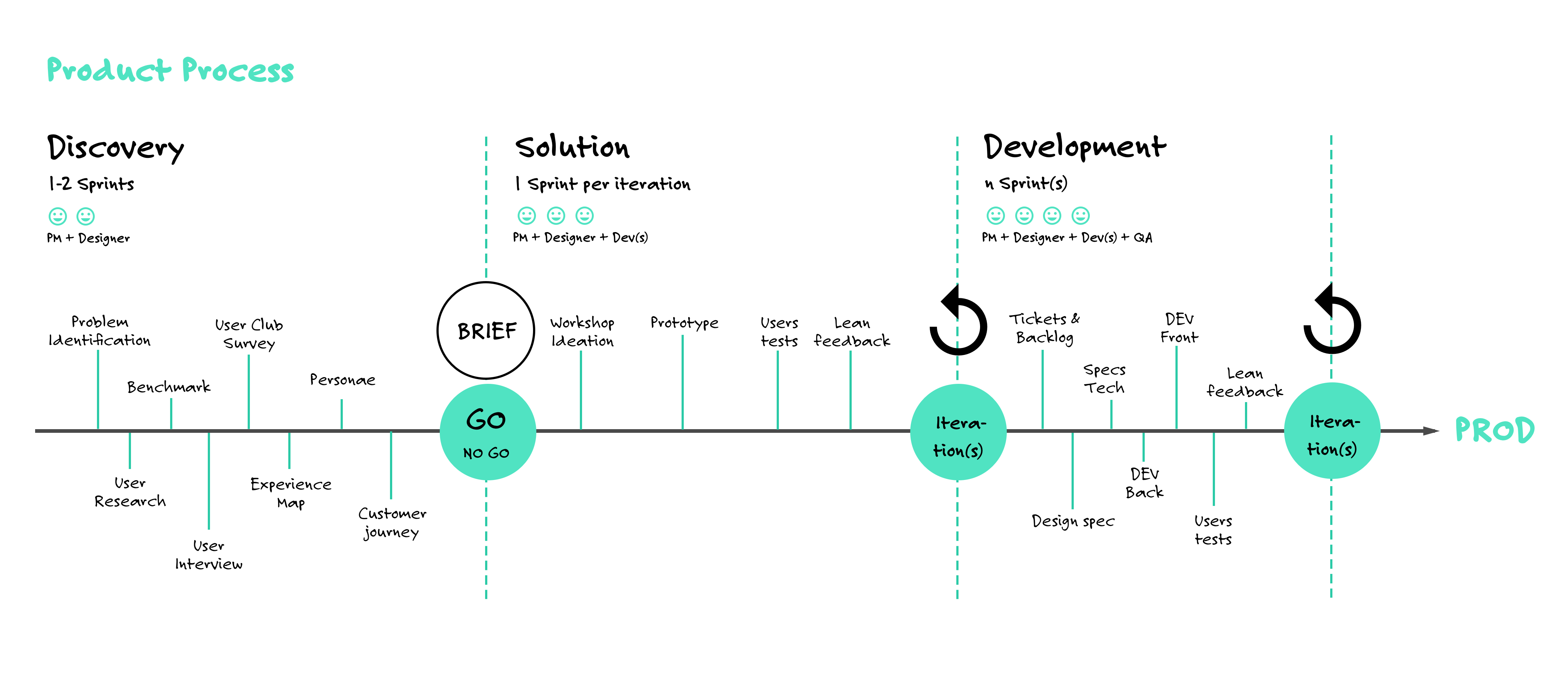
It outlines the workflow of product management, design and development we’ve put into practice to ship a new major feature. Now we’re going to explain how we followed the 2 first main steps of this workflow (Discovery, Solution) and what we learned on the way, i.e. how we narrowed down problems worth fixing and how we looked for appropriate solutions.
1- Discovery = user research
Our goal during this step was to get a good understanding of the challenges and problems PrestaShop users are facing regarding stock management.
Qualitative discovery with 1:1 interviews
During the first weeks of user research, I spent hours interviewing PrestaShop merchants to really understand how they manage their stock. When I had the chance, I visited their warehouse or their shop to see how they’re organized.
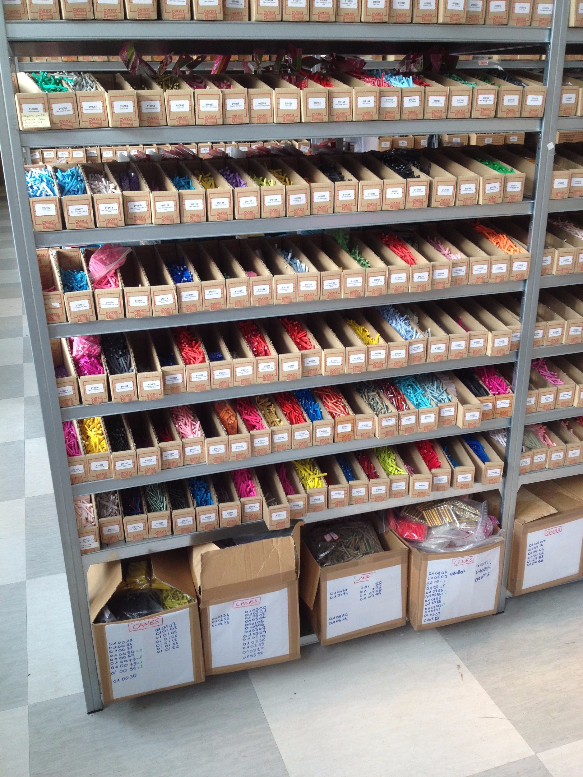
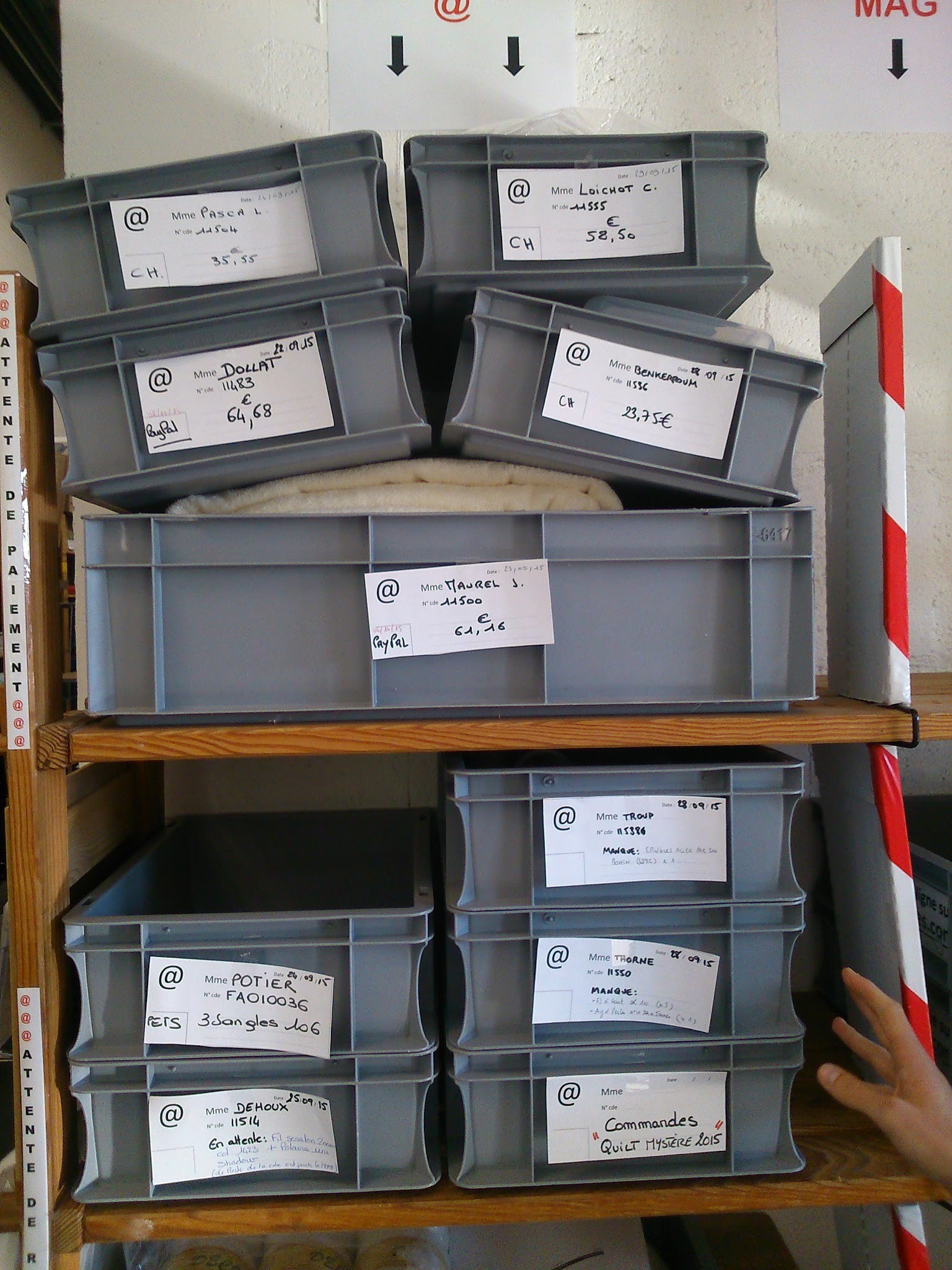
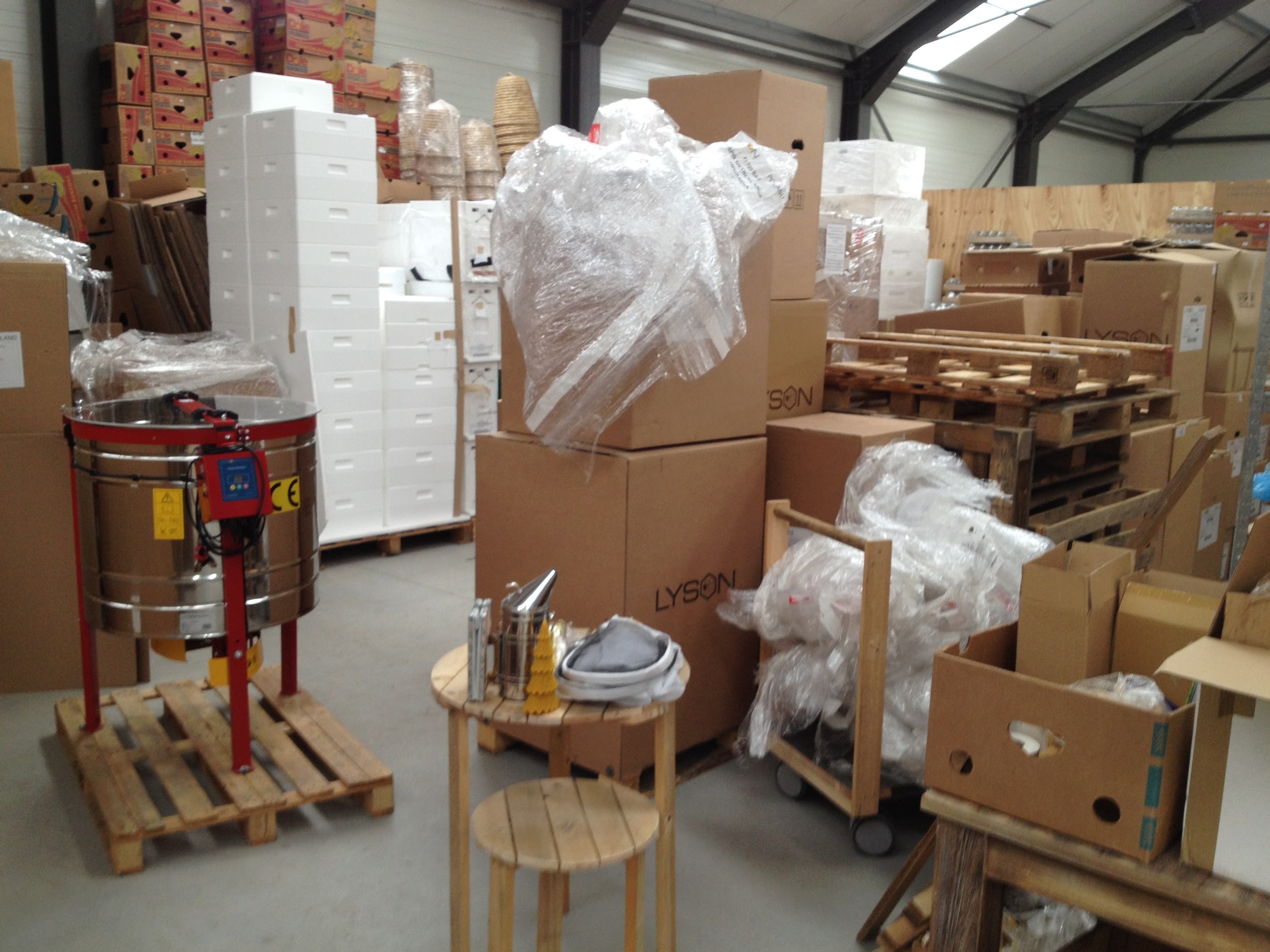
My questions to them were about:
- Their profile, the size of their online business.
- Their workflows, the tools they use.
- Their use-cases of PrestaShop.
- The problems or frustrations they were facing at the time with their tools.
After 15 of these interviews I was starting already to see what were the most common problems, needs and behaviors. I had identified 5 use-cases for stock management:
- Overview of stock level.
- Procurement: prepare purchase orders.
- Provisioning and adjustments: update the stocks when receiving purchase orders or when doing an inventory regulation.
- Preparation of customer orders.
- Accounting.
And the main problems with Advanced Stock Management (ASM) in version 1.6 were the following:
- Too much setup at the beginning, after enabling ASM.
- Many bugs (especially inconsistent stock values).
- Too complex to use: updating a quantity required many steps, it wasn’t adapted to supply order management nor multi-warehouse management.
Quantitative validation with online survey
Based on these interviews but also on feedback on our bug tracking tool, I started drawing hypotheses about PrestaShop merchants’ needs regarding stock management. In order to confirm or invalidate these assumptions, I sent a survey to our User Club. It received 65 responses, from 10 different countries. The results were the following.
Hypothesis #1: “Very few merchants actually use Advanced Stock Management in PrestaShop 1.6.”
=> TRUE
The result of the survey was a bit surprising at first. When I asked the merchants about the tools they use to manage their stocks, 26% of them answered they only relied on 1.6’s Advanced Stock Management feature, which was a lot more than I expected. However, looking at their comments in the next question, I discovered they were actually struggling to make it work.
Verbatims from these very same people were:
“Products that have physical stock but there is nothing in stock!”
“Quantity at adv mgmt doesn’t tally with available stocks.”
“Stock management is not stable.”
“I have problems with certain articles. I cannot remove them because there is physical stock. But there is no stock!”
In the end, it turned out they were trying to use ASM but not actually using it.
Hypothesis #2: “Most of the small-sized merchants only have one warehouse.”
=> FALSE
I assumed that only larger merchants (with many products in catalog and many orders per day) would have more than 1 warehouse.
But the survey showed that there’s no significant difference between small and large merchants in their number of warehouses they have, and about 20% of them actually had more than one warehouse… which brings us to the next hypothesis ;)
Hypothesis #3: “ASM does not meet the merchants’ most essential needs.”
=> TRUE
Based on the qualitative interviews and my own experience of ASM, I already had a hunch that this hypothesis was true.
What the survey confirmed is that for 35% of the people who tried ASM and gave up, the main reasons were that it didn’t fit their needs or it didn’t work correctly.
More interestingly, the survey allowed to rank the features merchants look for and want to rely on with PrestaShop’s ASM:
- Track stock movements.
- Overview of catalog stock.
- Procurement / Manage supply orders.
- Estimate stock coverage.
- Multi-warehouse.
If we also consider the corresponding comments which described…:
- The interfaces to increment/decrement stock as too clunky,
- The quantities displayed in different parts of the back-office as inconsistent,
- The global lack of reliability…
…then the conclusion was that PrestaShop ASM didn’t do its job well, even for simple tasks like displaying a stock overview or editing quantities. It also showed that “ERP-like” features such as multi-warehouse management were not the merchants’ top need.
2- Solution = build a solution that meets users’ needs
Once user research was completed, we formalized an initial brief, described in the previous article, and stated our intention: provide merchants with a new inventory management interface that allows them to get a clear and consistent overview of their stock, to quickly edit quantities and to track stock movements.
To complete this goal:
- We assembled a team consisting of 1 product manager + 1 product designer + 2 developers.
- We adopted an iterative process to test our ideas.
During each of the 4 sprints*, our routine was the following:
- Ideation workshop: the team assembled to sketch solutions ideas to specific problems.
- Prototype crafting.
- Test the prototype with 5 users.
- Debrief together and decide what to work on during the next sprint.
* a sprint is a development iteration. It lasts 2 weeks at PrestaShop.
Sprint #1
What we wanted to test
- If the table presentation of stocks is easy to understand.
- If people catch the meaning of physical, reserved and available stock.
- If users can edit product quantities, either one by one or in bulk.
Prototype
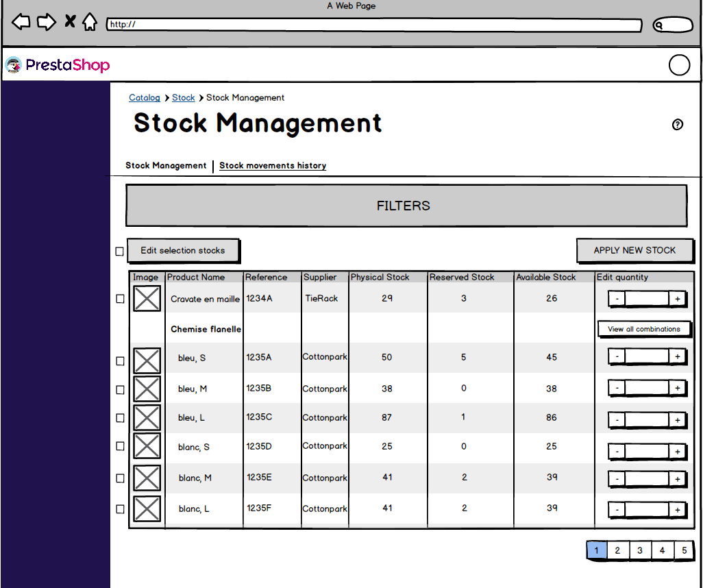
The first prototype was made with Balsamiq. It looks “low-fidelity” but allowed to quickly test our first interfaces without over-designing it.
What we learned
- The table’s structure was clear and the notions of physical, reserved and available stocks easy to understand.
- The process to edit quantities was too long, with too many steps.
- The presentation of products with combinations wasn’t clear… and unfortunately it took us time to realize we got it wrong!
Reflecting on that last point now, the problem is that we tried to over-anticipate a technical limitation that actually didn’t exist - remember the “premature optimization is the root of all evil!”. In order to avoid performance limitations when displaying products that have hundreds or even thousands of combinations (as we wrongly thought so), we designed a specific table for the combinations of a product, accessible with the “view all combinations” button. In the next prototypes we stuck with it, looking for a local optimum by marginally improving the UI instead of questioning the UX. Fortunately we realized the issue afterwards!
Sprint #2
What we wanted to test
- If the new steps to edit the quantities were simple and fast enough.
- If people would better understand the presentation of product with combinations.
- If testers could use the bulk edition of quantities.
- If users understood how they could specify a movement label for a stock edition.
Prototype
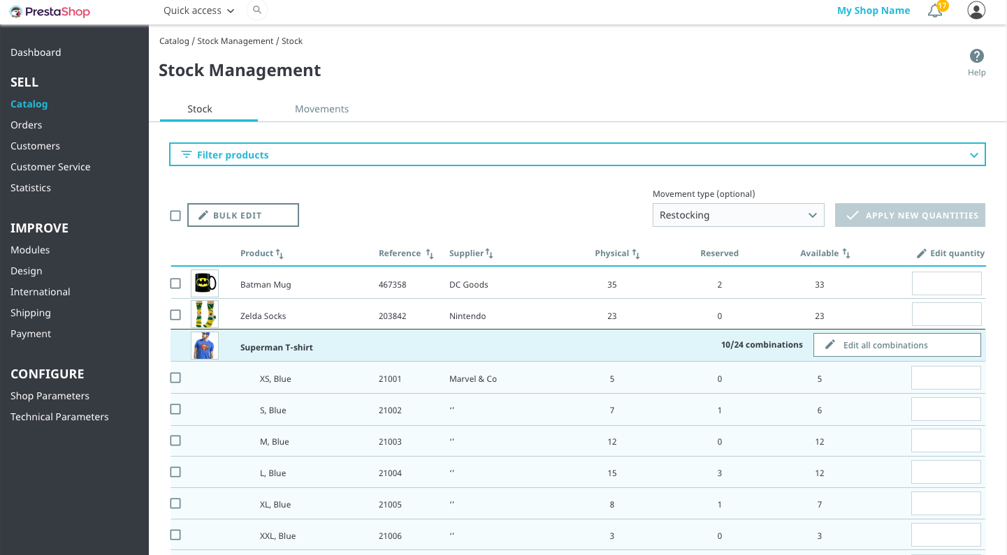
This one was made with Sketch and the flow was set up on Invision in order to give a more “real” experience and help users project themselves in the prototype.
What we learned
- Edition of quantities was simple enough and the input field to edit quantities was fine.
- Most of the testers didn’t understand the steps to follow to edit quantities in bulk. After this test, we decided to put this feature of bulk edition on hold since it wasn’t clear how we could solve this problem and it wasn’t a critical need.
- Users didn’t see / need / understand how they could give a movement reason.
Sprint #3
What we wanted to test
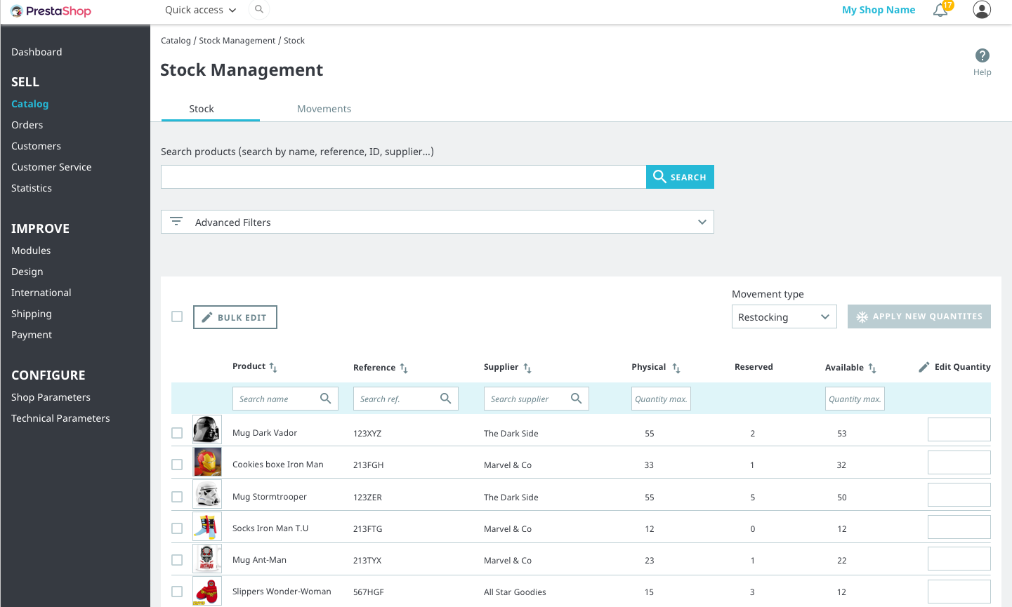
- How users look for products: either with the search bar + filters, or with quick search fields above the table.
- If the ‘advanced filters’ were relevant.
- If this interface could be enough to prepare supply purchases (procurement).
Prototype
What we learned
- The search bar and filters were users’ first instinctive choice. There was no real case to keep the quick search fields above the table.
- This interface would not be convenient to prepare procurement: it lacked essential information like alert stock level, ideal stock level, purchase prices, sales stats…
Sprint #4
What we wanted to test
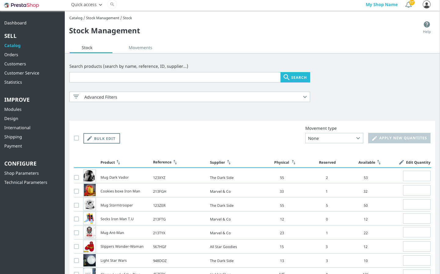
- If users can specify a stock movement label when editing quantities, whether it’s for one product or for several products at once.
- If users find how they can have an overview of the stock movements history and if the stock movements table is understandable.
- If the stock movement history table could be suitable for accounting purposes.
Prototype
What we learned
- Users succeeded in using movement type labels, but with difficulties. It seemed the steps order was not was they expected. Moreover, it lacked labels: users wanted to add their own labels. Since it wasn’t very conclusive, we decided to put this feature on hold and work on other solution candidates after the launch of a first version of this interface.
- The table of stock movements would absolutely not be convenient for accounting: it lacked too many information. That would be a topic for a more advanced feature.
Conclusion
At the end of these 4 iterations we estimated we had collected enough feedback to move on with the development of the interfaces. Inevitably, we spotted new issues during the development and we had to find other creative solutions. When we felt stuck we always arbitrated in favor of the simplest solution. So please don’t assume the first version will look exactly the same as in the prototypes.
The 8 weeks we spent iterating over a new stock management interface were really exciting for the whole team. We contacted 20 people from all around the world and collected extremely useful feedback. Thanks to doing the test remotely over Skype, testers could share their screen and show us how the creative features and workarounds they developed to solve their stock management needs: it was a great source of inspiration!
Call for volunteers
It is thanks to this precious user feedback that we could iterate upon several prototype versions. You want to be part of the next test sessions and help us improve PrestaShop’s stock management system? Then register today!
Of course your participation is optional but we would be really happy if you accept to take part in the tests. The more people participate, the more we can improve PrestaShop. If you accept, depending on your profile, you’ll receive an invitation in the coming weeks for a test session. Tests are done remotely (on Skype or Google Hangouts) and usually last 30 minutes. It can be done in English or French.
See you in the third an final article about stock management in 1.7 – or at the next test session!

