Starter Theme: fresh news from the front #3
What's up about Starter Theme
It’s been a while since we gave you any news about the StarterTheme. So, let’s sum up what happened since Starter Theme: Fresh News From The Front #2.
Page layout
We don’t want to impose a 3 columns layout for template developers anymore. We want to make something more flexible. As a theme developer, you will be able to ship your theme with as many layouts as you want. For example you can have a full width layout, 2 columns split in 2 halves or one third/two third. Better yet, you can add hooks inside template so you can have specific sidebars. PrestaShop users will be able to select the wanted layout directly in the back office, among those supported by the theme.
Checkout process
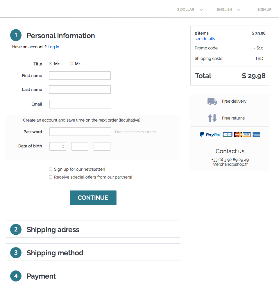
We have removed the 5-steps checkout process. From now on, there will be the One-Page-Checkout only. Template designers will be able to easily transform it in other types of checkout by playing with JavaScript and CSS.
Another big change regarding the checkout process is that it will be displayed with a simplified and minimalistic layout, without any website decoration, in order to prevent the customers from being distracted during the checkout process.
By default, guest checkout will be enabled, so the password will be facultative. Customers will be re-invited to register at the end of the process. This way, we expect the purchase process to be much quicker and more effective.
The Starter Theme also displays a cart summary, without any actions possible, on the right. It allows the customer to always know what he is buying, how much it will cost him, etc.

Payment API
To provide the best user experience possible for customers, and to guarantee that PrestaShop orders respect the law in all countries, we implemented a new payment API. To do that, we chose to respect the strictest requirements we know about : the German ones.
The German requirements being strict doesn’t mean that the checkout process will be tedious. To the contrary, the way we need to structure the page to abide by German best practices results in a user experience that is very reassuring to customers and helps increase conversion rate.
For example, the Terms & Conditions checkbox is now displayed with the payment options, and there is only one button to pay.
That way, we have more control of the layout of payment options.
To help you to create or adapt your payment modules, we have reworked the bankwire module and developed the paymentexample module. This new module is an example of what you can do. It implements 4 types of payment:
-
offline: call a simple URL, like bankwire or cheque
-
externally: call a simple URL but a third-party webserver processes the payment, like PayPal
-
embedded: write the credit card details on the website directly in a form, like Stripe
-
in iframe: payment form displayed inside an iframe, like Paypal Integral Evolution
// PHP
public function hookPaymentOptions($params)
{
  if (!$this->active) {
      return;
  }

  if (!$this->checkCurrency($params['cart'])) {
      return;
  }

  $this->getTemplateVarInfos();

  $newOption = new PaymentOption();
  $newOption->setCallToActionText($this->l('Pay by Bank Wire'))
                ->setAction($this->context->link->getModuleLink($this->name, 'validation', array(), true))
                ->setAdditionalInformation($this->context->smarty->fetch(implode(DIRECTORY_SEPARATOR, [__DIR__, 'views', 'templates', 'front', 'payment_execution.tpl'])))
                ->setLogo(Media::getMediaPath(_PS_MODULE_DIR_.$this->name.'/bankwire.jpg'));

  $payment_options = [
      $newOption,
  ];

  return $payment_options;
}
Faceted/layered navigation, pagination and search
In order to simplify the .tpl and .js files for all the faceted navigation, pagination and search, and to remove all the calculation from the front office (which is one of the main purpose of the StarterTheme) we have fully rewritten the whole thing. @djfm was responsible for that part. It would be too complicated to easily explain or transcript the work here, so don’t hesitate to look at it on GitHub.
Accordind to standards, we have chosen to call “Filter” a value which helps us to find the corresponding products (like red, XL or a price range) and to call “Facet” a collection of filters (like color, size or price). From now on we’ll also refer to “Faceted navigation” when in previous version we were mentioning layered navigation.
One of the main innovations in this part of the theme is that now all product listing controllers (Manufacturer, Supplier, Search…) share the same behavior and can all delegate the search to modules in a nice, standard fashion. From now on, modules only need to do the search, no rendering.
Contact Form
We have transformed the contact form system into a widgetized module: Contact Form. You can now put your contact form anywhere easily. You can look at it on GitHub.
Cleaning
Some features will no longer be supported in PrestaShop 1.7:
-
We will ship 1.7 without the Live Edit. We will write a newer and better Theme Builder (its new name) later. That’s why we introduced the widget system.
-
We also removed the ThemeConfigurator which couldn’t be supported by another template than default-bootstrap. We would like to provide a module to configure all the template settings in one place. It will be reusable by every other template developers.
Next step: we need to merge the feat/starter-theme branch into the develop branch, and start using the StarterTheme to build the new default theme for 1.7.
We’re still listening to what you have to say about this project, so don’t hesitate to get involved and contribute. Join the party on the Trello board and Gitter!
